
Colour Contrast in Australia: WCAG 2.2 AA and the DDA
The contrast ratios Australian Government sites aim for under WCAG 2.2 AA, why the DDA matters for everyone else, and a federal design system's colours checked.
By Redbison Dev · · 7 min read
Australia edition. Built on the Disability Discrimination Act 1992 (section 24, goods, services and facilities), Australian Government sites aiming at WCAG 2.2 AA with the Digital Service Standard, and the Agriculture Design System's palette. US edition
Australian websites are measured against the same WCAG contrast thresholds as everywhere else: 4.5:1 for normal text, 3:1 for large text, and 3:1 for borders, icons and focus indicators. What differs is why. Australian Government sites aim to conform with WCAG 2.2 at level AA alongside the Digital Service Standard, while every organisation that provides goods, services or facilities is covered by the Disability Discrimination Act 1992. This edition sets out that position, explains the ratio, and checks the light palette of a federal government design system pair by pair. Every ratio here can be repeated in the Australian colour contrast checker.
The Australian position
- The law for everyone. The Disability Discrimination Act 1992 makes disability discrimination unlawful in a set of areas; section 24 covers goods, services and facilities, and section 29A sets out the unjustifiable hardship test. The Act does not mention websites, but a website is often the way goods, services and facilities are provided.
- The target for government. Agencies state their target on their accessibility pages. The Department of the Prime Minister and Cabinet, for example, says its site aims to conform with WCAG 2.2 at level AA and with the Australian Government's Digital Service Standard.
- Design systems. Agencies building services share design systems. The Department of Agriculture, Fisheries and Forestry's Agriculture Design System (AgDS) says its foreground colours are designed to sit on its background colours so that contrast meets WCAG 2.1 level AA.
WCAG 2.1 and 2.2 use the same contrast rules, so a palette built for 2.1 AA still passes the contrast part of 2.2 AA.
| What | Success criterion | Minimum at AA | AAA |
|---|---|---|---|
| Normal text | 1.4.3 Contrast (Minimum) | 4.5:1 | 7:1 |
| Large text: 24 px regular, or 18.66 px bold | 1.4.3 | 3:1 | 4.5:1 |
| Input borders, icons, focus indicators, chart lines | 1.4.11 Non-text Contrast | 3:1 | none |
How the ratio is worked out
Each colour is converted to a relative luminance between 0 and 1. The red, green and blue channels are divided by 255, linearised (values up to 0.04045 are divided by 12.92, larger ones become ((c + 0.055) ÷ 1.055)^2.4) and weighted 0.2126, 0.7152 and 0.0722. Then:
contrast = (L lighter + 0.05) ÷ (L darker + 0.05)
W3C's understanding document for 1.4.3 says the computed values "should not be rounded (e.g., 4.499:1 would not meet the 4.5:1 threshold)". The checker decides on the exact ratio and truncates the display, so #777777 on white reads 4.47:1 and fails, and #767676 reads 4.54:1 and passes.
Large text is 18 pt, or 14 pt bold, at 1 pt = 1.333 px. In CSS that is 24 px regular or about 18.66 px bold (weight 700 or more). An 18 px bold subheading is still normal text and needs 4.5:1.
A federal palette, checked
AgDS publishes its light palette. Running it through the checker:
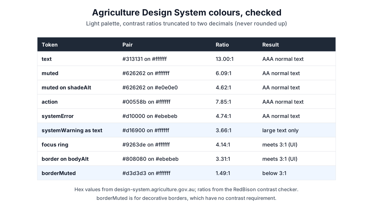
| Token pair | Ratio | Result |
|---|---|---|
text #313131 on white | 13.00:1 | AAA |
muted #626262 on white | 6.09:1 | AA |
muted #626262 on shadeAlt #e0e0e0 | 4.62:1 | AA, with little to spare |
action #00558b on white | 7.85:1 | AAA |
systemError #d10000 on bodyAlt #ebebeb | 4.74:1 | AA |
systemWarning #d16900 on white | 3.66:1 | large text and UI only |
focus #9263de on white | 4.14:1 | meets 3:1 for a focus ring |
border #808080 on bodyAlt #ebebeb | 3.31:1 | meets 3:1 |
borderMuted #d3d3d3 on white | 1.49:1 | decorative only |
Four things are worth copying from how this palette is built:
- Status colours are not all text colours. The warning orange is 3.66:1 on white, enough for an icon, a border or 24 px text, not for a 16 px warning message. Dark text #313131 on the orange is 3.55:1, also short of 4.5:1. Put the warning message in the text colour next to an orange icon instead.
- Two border colours, on purpose. AgDS uses
borderfor non-decorative components that need 3:1, such as input borders, andborderMutedfor decorative lines that do not. 1.4.11 only applies where the border is needed to identify the control. - Check every background. The muted grey is 6.09:1 on white but 4.62:1 on the darker shade. One more step of background darkness and it fails.
- Do not rely on colour alone. AgDS underlines links as well as colouring them, which is a separate WCAG requirement from contrast.
Green and gold palettes
Green and gold palettes need care, and gold is the hard half. Some yellows from published government palettes, through the checker:
| Pair | Ratio | Usable for |
|---|---|---|
| GOV.UK focus yellow #ffdd00 on white | 1.34:1 | nothing on white; a background behind dark text |
| #0b0c0c text on #ffdd00 | 14.54:1 | any text |
| GC Design System yellow-600 #c28b0a on white | 3.00:1 | large text and UI only |
| White on GC green-600 #29a356 | 3.24:1 | large text only |
| White on GOV.UK success green #0f7a52 | 5.34:1 | any text at AA |
So gold works as a background behind dark text or as an accent beside the words that carry the meaning, and a mid green needs to be darker before white button labels pass. Check your exact hex values; the ratio is the same whichever colour is in front.
A workflow for Australian teams
- Set the target: WCAG 2.2 AA if you build for government, and as the practical benchmark under the DDA if you do not.
- List every real pair: body text, hint and placeholder text, links, buttons, alerts, focus states and chart lines, on each background they use.
- Check, record and fix by adjusting lightness, keeping the hue.
- Publish the result in an accessibility statement, including anything not yet fixed.
Tools for this job
- Australian colour contrast checker: the exact WCAG ratio for any pair, normal and large text, AA and AAA.
- Colour picker: nudge lightness until a pair passes.
- Colour palette generator: build a palette, then check each pair.
The guide to colour formats covers converting brand colours between hex, RGB and HSL.
Frequently asked questions
Is WCAG a legal requirement in Australia?
The Disability Discrimination Act 1992 is the law; it covers goods, services and facilities but does not name WCAG. Australian Government sites aim to conform with WCAG 2.2 AA, and that is the practical standard to measure against.
What contrast ratio does WCAG 2.2 AA need?
4.5:1 for normal text, 3:1 for large text (24 px, or 18.66 px bold), and 3:1 for user interface components such as input borders and focus indicators.
Can I use an orange or gold warning colour for text?
Only for large text if it is below 4.5:1. AgDS's warning orange is 3.66:1 on white, so use it for icons and borders and keep the message itself in the text colour.
Do decorative borders need 3:1?
No. Non-text contrast applies to visual information needed to identify a component or its state. A border that is the only sign an input is there needs 3:1; a decorative divider does not.
Sources and further reading
- Disability Discrimination Act 1992, Federal Register of Legislation. Section 24, goods, services and facilities, and section 29A, unjustifiable hardship.
- Accessibility, Department of the Prime Minister and Cabinet. An agency aiming for WCAG 2.2 AA and the Digital Service Standard.
- Colour tokens, Agriculture Design System. The light palette checked above, the WCAG 2.1 AA statement and the two border colours.
- Understanding Success Criterion 1.4.3: Contrast (Minimum), W3C WAI. Thresholds, large text and no rounding.
- Understanding Success Criterion 1.4.11: Non-text Contrast, W3C WAI. When borders and focus indicators need 3:1.
- Web Content Accessibility Guidelines (WCAG) 2.2, W3C. The relative luminance and contrast ratio definitions.
Open the Color Contrast Checker
More Design Tools
Every tool in the Design Tools section, free and in your browser.