
Colour Contrast in Canada: AODA, WCAG AA and Federal Sites
What colour contrast Ontario's AODA and federal guidance expect, how the WCAG ratio works, and the GC Design System palette checked pair by pair.
By Redbison Dev · · 7 min read
Canada edition. Built on Ontario's AODA rule (WCAG 2.0 AA for public websites since January 1, 2021), federal guidance pointing to EN 301 549 and WCAG 2.1 AA while the Standard on Web Accessibility is reviewed, and the GC Design System colours. US edition
In Canada the contrast rule your website must meet depends on who you are and where you operate, but the numbers barely change. Ontario's Accessibility for Ontarians with Disabilities Act (AODA) requires WCAG 2.0 Level AA for public websites of designated public sector organizations and of businesses and non-profits with 50 or more employees. Federal guidance points to WCAG 2.1 AA and the European standard EN 301 549 while the federal Standard on Web Accessibility is reviewed. All of those versions share the same contrast test: 4.5:1 for normal text and 3:1 for large text, with WCAG 2.1 adding 3:1 for borders, icons and focus indicators. This edition explains the Canadian rules, the calculation, and checks the Government of Canada's own design system colours. Every ratio here can be repeated in the Canadian colour contrast checker.
Ontario: the AODA rule
Ontario's guidance, How to make websites accessible, says the AODA requires you to make all public websites accessible if you are a designated public sector organization, or a business or non-profit with 50 or more employees. The rules:
- Standard: WCAG 2.0 Level AA, with two exemptions, 1.2.4 (live captions) and 1.2.5 (pre-recorded audio descriptions). Level A criteria generally have to be met as well.
- Date: public websites had to comply by January 1, 2021.
- Scope: websites and web content published after January 1, 2012, controlled by the organization directly or through a contract.
- Internal sites: intranets and extranets do not have to meet WCAG 2.0 AA, except those of the Government of Ontario and the Legislative Assembly.
For contrast, WCAG 2.0 AA means success criterion 1.4.3: 4.5:1 for normal text, 3:1 for large text. WCAG 2.0 has no non-text contrast criterion; that arrived in WCAG 2.1 as 1.4.11. An Ontario site that meets only the legal minimum can therefore have pale input borders and still comply, but it fails the federal and international benchmark.
Federal: a standard under review
The Government of Canada's accessibility resource centre says the Treasury Board of Canada Secretariat is reviewing the Standard on Web Accessibility, and is seeking input on Phase One of a draft Standard on Information and Communications Technology (ICT) Accessibility. Meanwhile it recommends that organizations adopt the harmonised European standard EN 301 549, and strongly encourages following WCAG 2.1 AA, the version aligned with EN 301 549 (2018).
In practice, then, a Government of Canada site should plan for WCAG 2.1 AA contrast: the 1.4.3 text ratios plus 1.4.11 non-text contrast.
| What | Success criterion | WCAG version | Minimum |
|---|---|---|---|
| Normal text | 1.4.3 Contrast (Minimum) | 2.0, 2.1, 2.2 | 4.5:1 |
| Large text: 24 px regular, or 18.66 px bold | 1.4.3 | 2.0, 2.1, 2.2 | 3:1 |
| Borders, icons, focus indicators | 1.4.11 Non-text Contrast | 2.1, 2.2 | 3:1 |
| Enhanced text (AAA) | 1.4.6 | 2.0, 2.1, 2.2 | 7:1 |
How the ratio works
Each colour becomes a relative luminance from 0 to 1: the sRGB channels are divided by 255 and linearised, then weighted 0.2126 red, 0.7152 green and 0.0722 blue. The contrast ratio is (lighter + 0.05) ÷ (darker + 0.05), from 1:1 to 21:1.
W3C's understanding document for 1.4.3 says computed values "should not be rounded (e.g., 4.499:1 would not meet the 4.5:1 threshold)". The same rule holds for 3:1 under 1.4.11, where W3C notes that 2.999:1 fails. The checker therefore decides on the exact value and truncates the display: #777777 on white shows 4.47:1 and fails, #767676 shows 4.54:1 and passes.
Large text is 18 pt, or 14 pt bold, and W3C gives 1 pt as 1.333 px. That makes 24 px regular and about 18.66 px bold the smallest sizes allowed to use 3:1. A 19 px semibold (600) heading is normal text.
The GC Design System palette, checked
The GC Design System publishes its colour tokens with a contrast ratio for each. Rechecking them shows how close some sit to the line:
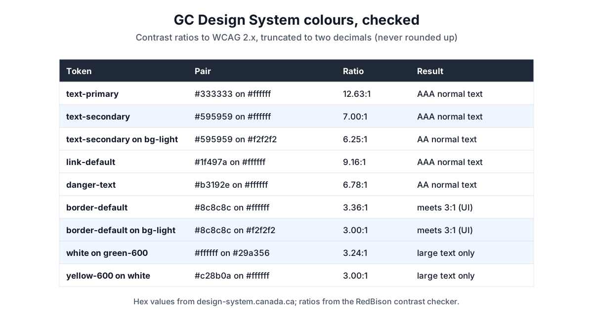
| Token pair | Ratio | Result |
|---|---|---|
text-primary #333333 on white | 12.63:1 | AAA |
text-secondary #595959 on white | 7.00:1 | AAA, by 0.0047 |
text-secondary #595959 on bg-light #f2f2f2 | 6.25:1 | AA, not AAA |
link-default #1f497a on white | 9.16:1 | AAA |
danger-text #b3192e on white | 6.78:1 | AA |
border-default #8c8c8c on white | 3.36:1 | meets 3:1 |
border-default #8c8c8c on bg-light #f2f2f2 | 3.00:1 | meets 3:1, by 0.0038 |
White on green-600 #29a356 | 3.24:1 | large text only |
yellow-600 #c28b0a on white | 3.00:1 | large text only |
What this shows:
- Ratios depend on the background. The secondary text colour is AAA on white (7.0047:1, which the design system lists as 7) but only AA on the light grey background. A token's published ratio is against white unless stated.
- Some pairs sit right on the threshold. The default border on the light background is 3.0038:1. Any darker tint behind it, or an opacity change, pushes it under 3:1. Because the threshold is exact, this is a pass today and a fail after a small change.
- Mid greens and yellows are not text colours. White on the base green is 3.24:1, fine for a 24 px heading, not for a 16 px button label. The design system's own guidance is to check combinations for accessible contrast.
A workflow for Canadian teams
- Decide your target. AODA requires WCAG 2.0 AA, but designing to WCAG 2.1 AA costs little more and covers federal guidance and EN 301 549.
- List every real pair, including hint text, placeholder text, links in body copy, error messages and focus states, on every background they appear on.
- Check both official languages. English and French strings differ in length, so a translated label can wrap onto an image or a tinted panel that the other version never touched.
- Fix with lightness, keep the hue. Darken the text or lighten the background until the exact ratio passes.
- Test dark mode separately. Swapping the pair gives the same ratio, but a dark palette is a different set of colours.
Common mistakes
- Reading 18 as 18 px. Large text starts at 24 px regular or 18.66 px bold.
- Trusting a rounded display. 4.47:1 is a fail.
- Ignoring borders because AODA uses WCAG 2.0. Federal guidance and EN 301 549 bring in 1.4.11.
- Testing a token instead of the rendered colour. Opacity and overlays change what reaches the screen.
Tools for this job
- Canadian colour contrast checker: exact WCAG ratios for any pair, AA and AAA, normal and large text.
- Colour picker: adjust lightness until a pair passes.
- Colour palette generator: build a palette, then check each pair.
The guide to colour formats covers hex, RGB and HSL conversions.
Frequently asked questions
Which WCAG version does the AODA require?
WCAG 2.0 Level AA for public websites, with exemptions for 1.2.4 (live captions) and 1.2.5 (pre-recorded audio descriptions). The compliance date was January 1, 2021.
Does my Ontario business have to meet the website rule?
If it has 50 or more employees, Ontario's guidance says its public websites must meet WCAG 2.0 AA. Designated public sector organizations are covered regardless of size.
What contrast do federal sites need?
Federal guidance strongly encourages WCAG 2.1 AA and recommends EN 301 549 while the Standard on Web Accessibility is reviewed. For contrast that means 4.5:1 for normal text, 3:1 for large text and 3:1 for user interface components.
Is 3.00:1 enough for a form border?
Only if the exact ratio is at least 3. The GC Design System border on its light background is 3.0038:1, which passes; 2.999:1 would fail.
Sources and further reading
- How to make websites accessible, Government of Ontario. Who must comply, WCAG 2.0 AA, the January 1, 2021 date and the exemptions.
- Accessibility standards, Government of Canada accessibility resource centre. The Standard on Web Accessibility review, the draft Standard on ICT Accessibility, EN 301 549 and WCAG 2.1 AA.
- Colour, GC Design System. The tokens and published ratios checked above.
- Understanding Success Criterion 1.4.3: Contrast (Minimum), W3C WAI. Thresholds, large text and no rounding.
- Understanding Success Criterion 1.4.11: Non-text Contrast, W3C WAI. The 3:1 rule for borders and focus indicators.
- What's new in WCAG 2.1, W3C WAI. 1.4.11 Non-text Contrast added at Level AA.
- Web Content Accessibility Guidelines (WCAG) 2.0, W3C. The version the AODA cites.
Open the Color Contrast Checker
More Design Tools
Every tool in the Design Tools section, free and in your browser.