
Colour Contrast for UK Websites: WCAG 2.2 AA and the Law
What WCAG 2.2 AA contrast means for UK public sector sites under the 2018 regulations and for everyone else under the Equality Act, with GOV.UK colours checked.
By Redbison Dev · · 7 min read
United Kingdom edition. Built on the Public Sector Bodies Accessibility Regulations 2018 (WCAG 2.2 AA, monitored by GDS, enforced by the EHRC and ECNI), the Equality Act 2010 duty, and the current GOV.UK Design System palette. US edition
For a UK public sector website, colour contrast is a legal test, not a design preference. The accessibility regulations require WCAG 2.2 at level AA, which means normal text needs a contrast ratio of at least 4.5:1 against its background, large text 3:1, and borders, icons and focus indicators 3:1. Private sector sites are not covered by those regulations, but the Equality Act 2010 duty to make reasonable adjustments still applies to them. This edition explains who must meet what, how the ratio is worked out, and checks the GOV.UK Design System's own colours, so you can see what passing looks like. Every ratio here can be repeated in the UK colour contrast checker.
Who has to meet WCAG 2.2 AA in the UK
GOV.UK's guidance on accessibility requirements for public sector websites and apps sets out the position:
- The regulations. The Public Sector Bodies (Websites and Mobile Applications) (No. 2) Accessibility Regulations 2018 came into force for public sector bodies on 23 September 2018.
- The standard. Meeting them means meeting WCAG 2.2 at AA level, subject to valid exemptions. The guidance was updated for the new WCAG 2.2 success criteria on 5 October 2023.
- The statement. Each body must publish an accessibility statement explaining how accessible its site or app is, and review it regularly. Contrast failures you know about belong in it.
- Monitoring. The Government Digital Service (GDS) monitors compliance on behalf of the Minister for the Cabinet Office, testing a sample of sites and apps each year.
- Enforcement. The Equality and Human Rights Commission (EHRC) in England, Scotland and Wales, and the Equality Commission for Northern Ireland (ECNI), enforce the requirements.
- Everyone else. All UK service providers must make reasonable adjustments under the Equality Act 2010 (the Disability Discrimination Act 1995 in Northern Ireland). The guidance notes that this duty still applies to organisations exempt from the regulations.
WCAG 2.2 did not change the contrast rules. The GOV.UK Design System's colour page notes that success criterion 1.4.3, Contrast (Minimum), is unchanged from WCAG 2.1. If your site passed contrast under 2.1, it still does; what WCAG 2.2 added are other success criteria.
The three numbers
| What | Success criterion | Minimum at AA | AAA |
|---|---|---|---|
| Normal text | 1.4.3 Contrast (Minimum) | 4.5:1 | 7:1 (1.4.6) |
| Large text: 24 px regular, or 18.66 px bold (700+) | 1.4.3 | 3:1 | 4.5:1 |
| Borders, icons, focus indicators, chart lines | 1.4.11 Non-text Contrast | 3:1 | none |
Large text is defined in points (18 pt, or 14 pt bold), and CSS fixes 1 pt at 1.333 px. So 24 px regular and 18.66 px bold are the smallest sizes that may use 3:1. An 18 px bold label, or a 19 px semibold (600) heading, is normal text and needs 4.5:1.
How the ratio is calculated
Each colour is turned into a relative luminance between 0 (black) and 1 (white): each sRGB channel is divided by 255, linearised (values at or below 0.04045 are divided by 12.92, larger ones are raised as ((c + 0.055) ÷ 1.055)^2.4), and the three are weighted 0.2126 red, 0.7152 green and 0.0722 blue. The ratio is then:
contrast = (L lighter + 0.05) ÷ (L darker + 0.05)
It runs from 1:1 (identical colours) to 21:1 (black on white). W3C's understanding document for 1.4.3 is explicit that the thresholds are exact: 4.499:1 fails 4.5:1. The checker decides on the unrounded value and truncates the display, so #777777 on white shows 4.47:1 and fails, while #767676 shows 4.54:1 and passes. That one step of grey is the lightest text on white that passes AA.
GOV.UK colours, checked
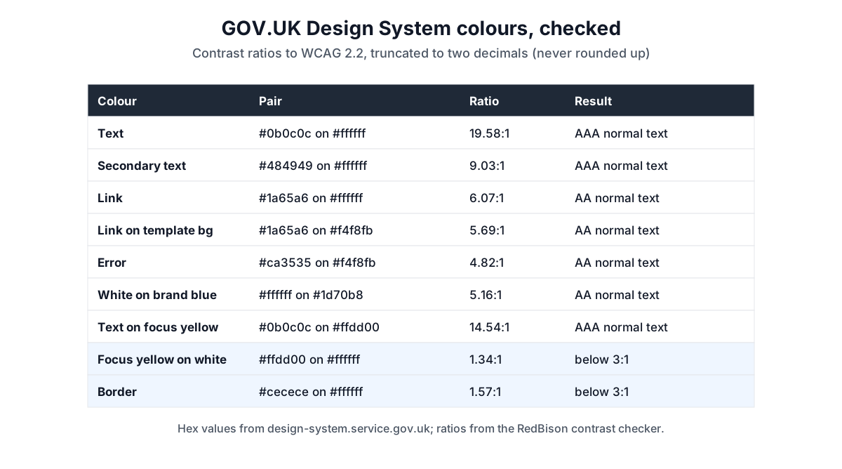
The GOV.UK Design System publishes its palette. Running its current colours through the checker:
| Pair | Ratio | Result |
|---|---|---|
| Text #0b0c0c on white | 19.58:1 | AAA |
| Secondary text #484949 on white | 9.03:1 | AAA |
| Link #1a65a6 on white | 6.07:1 | AA |
| Link #1a65a6 on template background #f4f8fb | 5.69:1 | AA |
| Error #ca3535 on #f4f8fb | 4.82:1 | AA |
| White on brand blue #1d70b8 | 5.16:1 | AA |
| Text #0b0c0c on focus yellow #ffdd00 | 14.54:1 | AAA |
| Focus yellow #ffdd00 on white | 1.34:1 | below 3:1 |
| Border #cecece on white | 1.57:1 | below 3:1 |
Three lessons come out of this. First, every text colour passes on both white and the tinted template background, but the margins shrink: the error red drops from 5.15:1 on white to 4.82:1 on #f4f8fb. Check text on every background it actually sits on. Second, yellow on white is almost invisible at 1.34:1. The design system reserves its focus yellow for the focus state; paired with the text colour it reaches 14.54:1, but a yellow outline on white alone would not meet the 3:1 of 1.4.11. Third, the light border colour is 1.57:1, so it cannot be the only thing that shows a form field is there: W3C says a border that is the only visual cue for a control must meet 3:1. The design system's guidance is to use its functional colours through the govuk-functional-colour Sass function rather than copying hex values, so check the rendered result, not just the token.
A UK workflow for an accessibility statement
- List every real pair: body text, links in paragraphs, buttons, error messages, hint text, table stripes, badges and focus states.
- Check each pair in the checker and record the ratio.
- Fix by lightness first. Darken text or lighten backgrounds without changing hue, so brand colours stay recognisable.
- Record what you cannot fix yet. The accessibility statement must say which parts are not accessible and why; a known contrast failure in a third-party component goes there with a date for the fix.
- Retest after design changes. GDS tests a sample of sites each year, and any new palette needs the same checks.
Common UK mistakes
- Using the 3:1 large-text rule for 18 px headings. 18 means 18 pt (24 px), not 18 px.
- Rounding. A 4.47:1 grey is a fail, whatever a design tool rounds it to.
- Text over photos in hero banners. Check against the lightest part of the image the text overlaps, or add a scrim.
- Assuming the private sector is exempt. The regulations cover public sector bodies; the Equality Act duty covers everyone providing services.
- Testing the token, not the render. Opacity and overlays change the colour that actually reaches the screen.
Tools for this job
- UK colour contrast checker: any foreground and background pair against WCAG 2.2 AA and AAA, with the exact ratio.
- Colour picker: adjust lightness in HSL until a failing pair passes.
- Colour palette generator: build a palette, then check every pair.
The guide to colour formats explains hex, RGB and HSL if you need to convert a brand colour first.
Frequently asked questions
Do private companies in the UK have to meet WCAG?
The 2018 regulations apply to public sector bodies. Private businesses are not named in them, but GOV.UK's guidance notes that all UK service providers must make reasonable adjustments under the Equality Act 2010, so the same contrast checks are a sensible baseline for any UK site.
Which WCAG version do UK public sector sites need?
WCAG 2.2 at AA level. The contrast criteria are the same as in WCAG 2.1: 4.5:1 for normal text, 3:1 for large text and 3:1 for non-text elements.
Who checks that public sector websites are accessible?
GDS monitors compliance by testing a sample of sites and apps each year, on behalf of the Minister for the Cabinet Office. The EHRC enforces in England, Scotland and Wales and the ECNI in Northern Ireland.
What is the lightest grey text that passes on white?
#767676, at 4.54:1. One step lighter, #777777, is 4.47:1 and fails AA for normal text.
Sources and further reading
- Understanding accessibility requirements for public sector bodies, GOV.UK. The 2018 regulations, WCAG 2.2 AA, accessibility statements, GDS monitoring, EHRC and ECNI enforcement and the Equality Act duty.
- Colour, GOV.UK Design System. The palette checked above, the focus colour rule and the note that 1.4.3 is unchanged from WCAG 2.1.
- Web Content Accessibility Guidelines (WCAG) 2.2, W3C. The relative luminance and contrast ratio definitions.
- Understanding Success Criterion 1.4.3: Contrast (Minimum), W3C WAI. The 4.5:1 and 3:1 thresholds, large text and no rounding.
- Understanding Success Criterion 1.4.11: Non-text Contrast, W3C WAI. The 3:1 rule for borders, icons and focus indicators.
Open the Color Contrast Checker
More Design Tools
Every tool in the Design Tools section, free and in your browser.